Posted Oct. 1, 2018
By Omar Mickelson
Introduction
In this blog, we will be identifying how the title page of an article in the New Era magazine utilizes the four main design principles, as well as color.
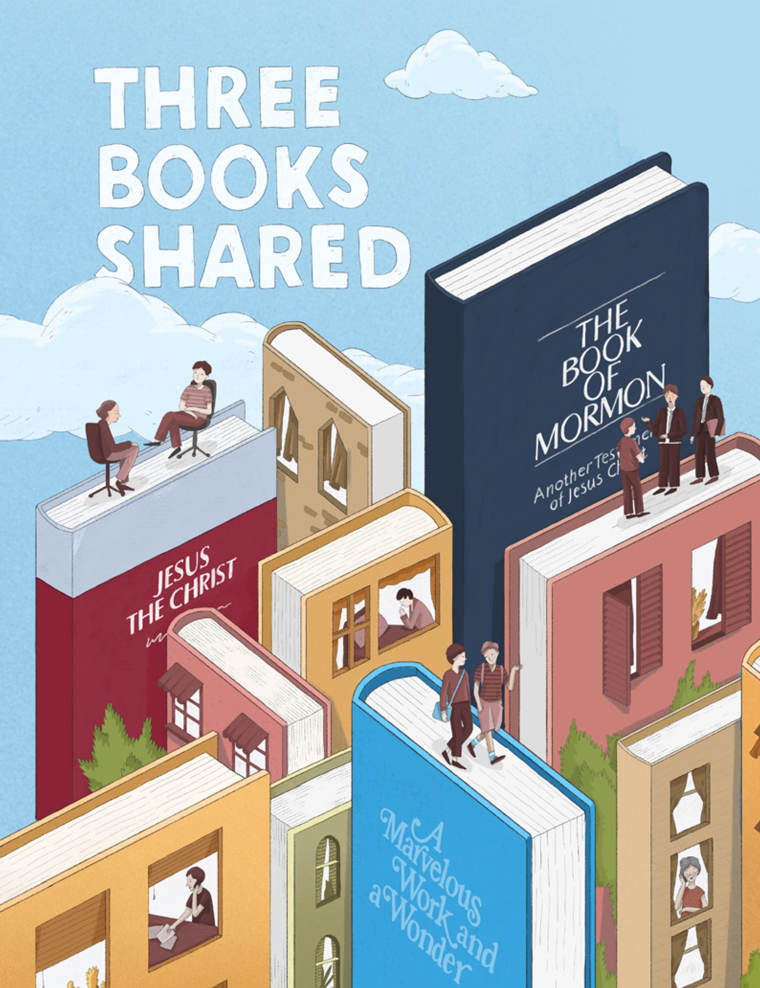
This article, titled “Three Books Shared” by Kevin Ludlow, is featured in the October 2018 issue of The Church of Jesus Christ of Latter-Day Saints’ magazine for Young Men and Young Women, while the picture on the cover was designed by Ukrainian illustrator Yev Haidamaka.
Link: https://www.lds.org/new-era/2018/10/three-books-shared?lang=eng
Analysis
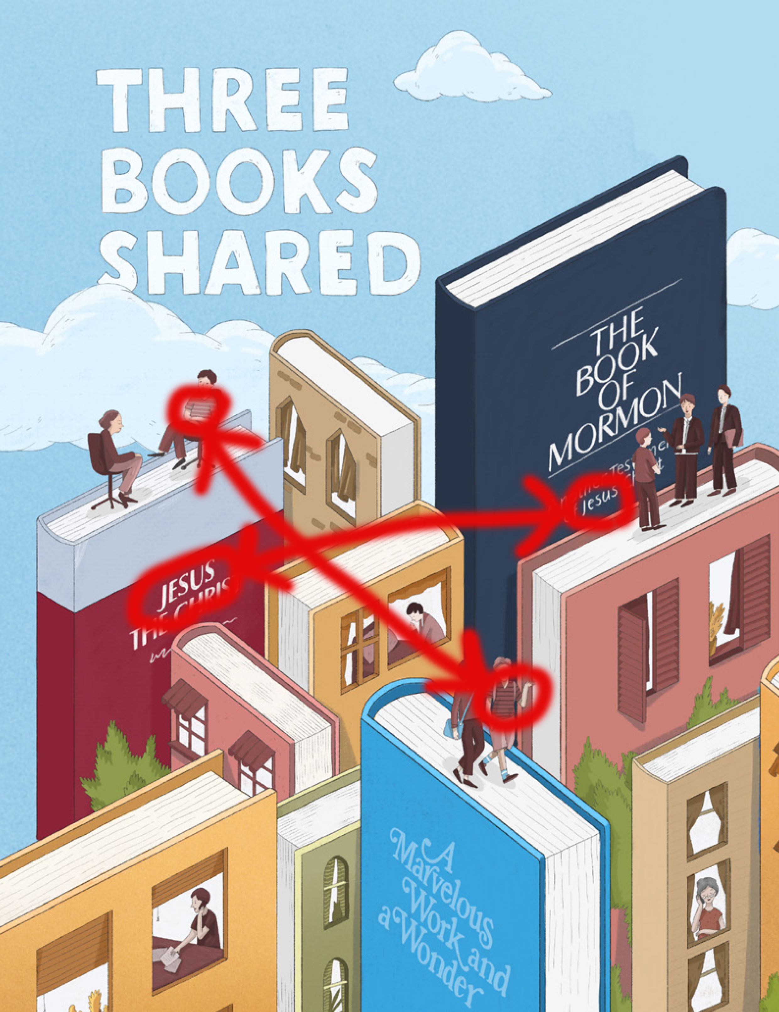
Contrast
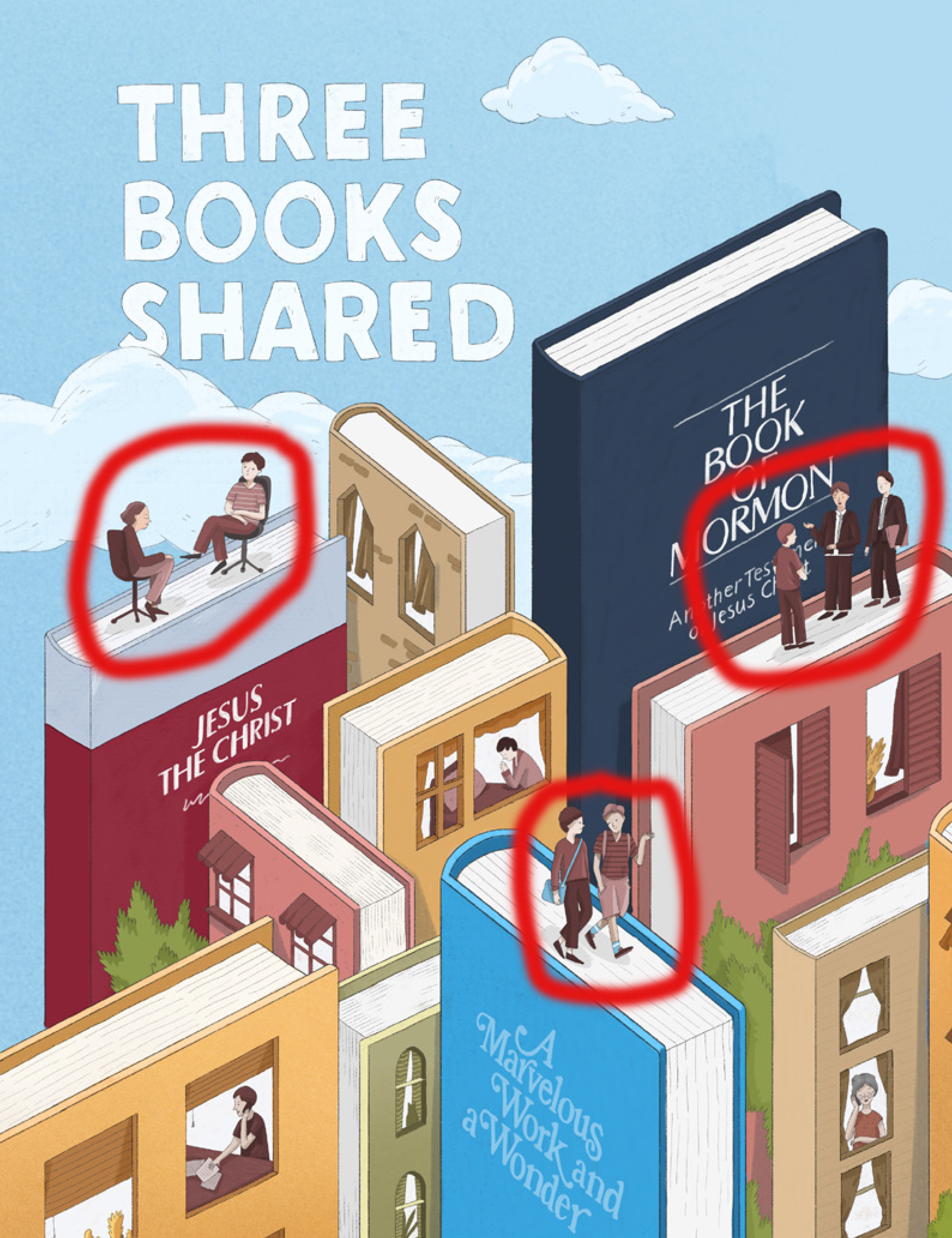
With this image, I’ve pointed out just a handful of the different ways that the cover page’s illustration has depicted the “people” interacting with others. To the far right, the three young men standing next to the copy of The Book of Mormon that towers over them, are standing, and it looks as if two of them are sharing a message with the other (I think it’s safe to say that they are made out to be Missionaries for the Church of Jesus Christ of Latter-Day Saints). Meanwhile, there are two other groups of two individuals each, who seem to be spreading a similar message about the books they appear to be situated upon; one striped shirt-wearing individual is conversing with a person dressed in brown, while walking on top of the pages of A Marvelous Work and Wonder, as opposed to two additional figures, donning similar clothes as the other two, seated in chairs on top of the pages of James E. Talmage’s book, Jesus the Christ.
Repetition
 In this image, I found a few instances where certain aspects of the front cover’s illustration were repeated. There are two books in the image where the name of Jesus Christ is used, which is necessary in reinforcing that the magazine’s article (as well as the whole of the magazine, for the most part) is heavily focused on religion, most especially with the religious organization of The Church of Jesus Christ of Latter-Day Saints. Also, the “people” depicted in the illustration have notably similar clothing patterns, from the two suit jacket-wearing men (presumably Missionaries for the church) off the middle right side to the two similar striped shirts that I have gone and circled in red here.
Alignment
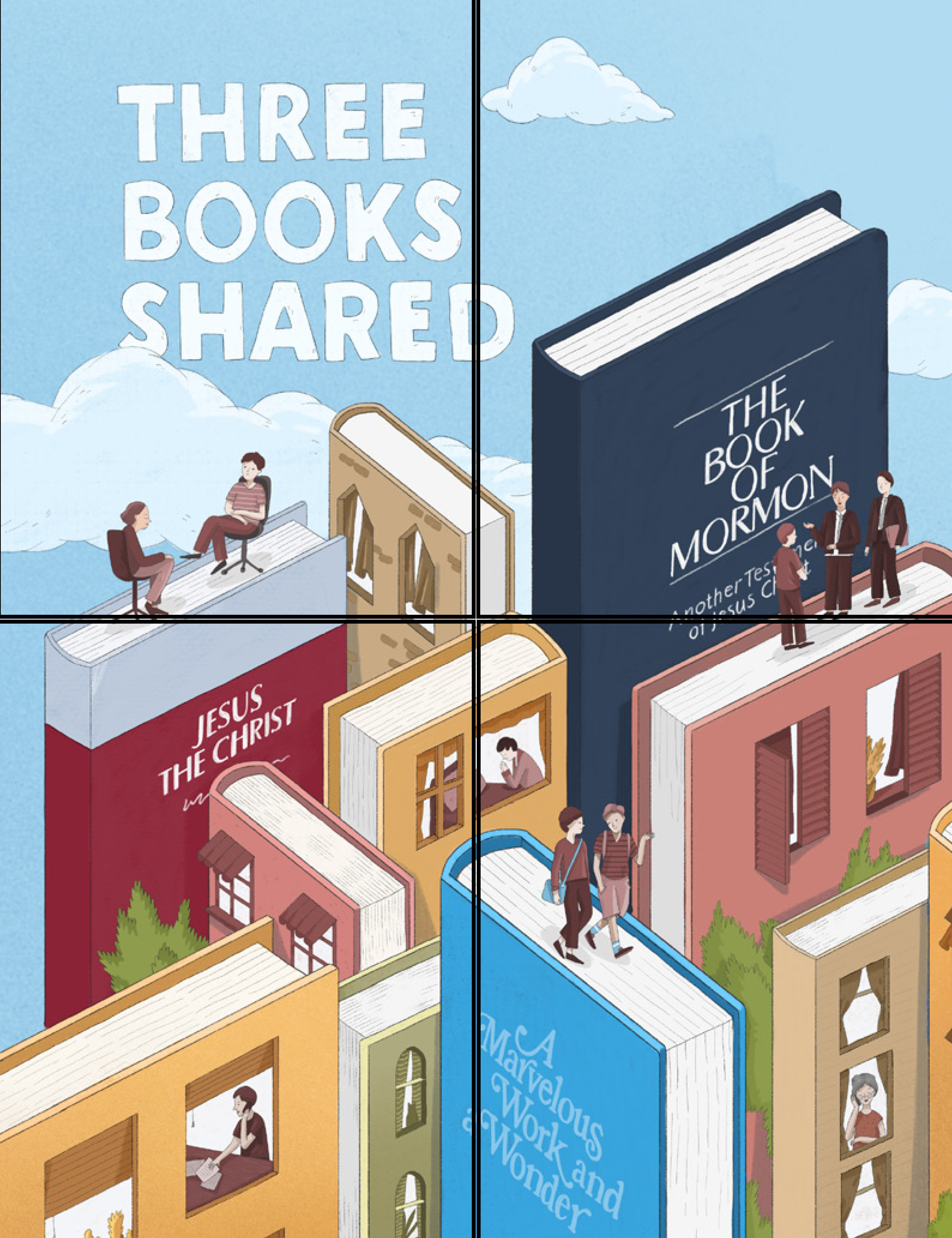
With this image, the alignment of the text is pretty off. There are quite a few points where text from the illustration literally rides the line of alignment, as they are almost perfectly sanctioned off into a respective corner, save for a little bit that bleeds over into another quadrant of the image. Still though, the actual title itself, shown to the top left of the page, showcases some creativity, in the way that a small part of the “S” in “shared” is hidden by some clouds.
Proximity
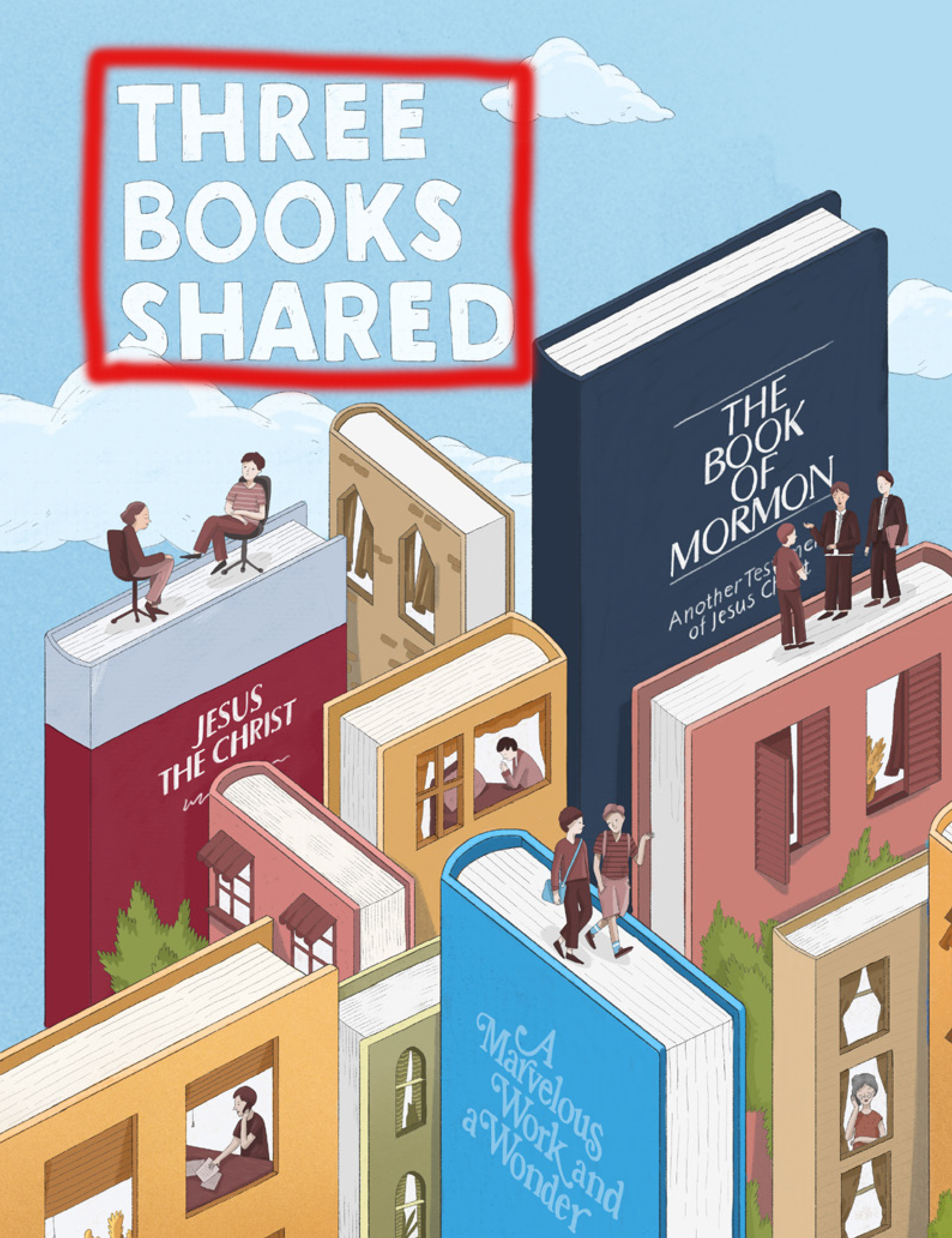 The image’s primary text is placed effectively into the environment that the illustration creates, situated at the top left of the article’s cover page in a reasonably safe manner, and in a location where there isn’t anything but clouds to share the area with. Had it been placed pretty much anywhere else on the cover, it would obscure and detract from the colorful and unique imagery created by the book-shaped buildings, and the people peppered throughout.
Color
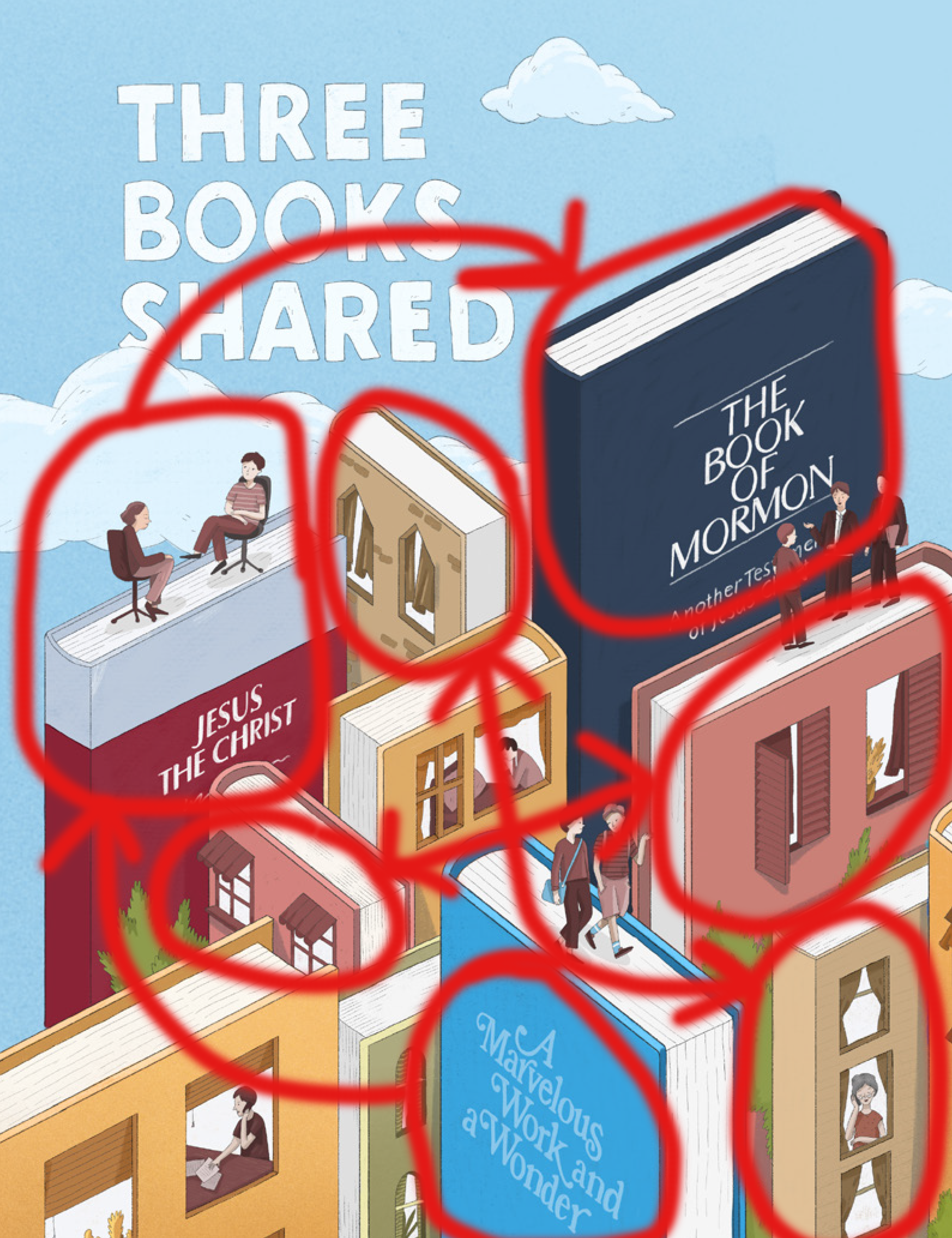 Lastly, the final thing we’re going to analyze on this image here, is the color patterns. Several of the “book-shaped” buildings are the same color as another; the most notable are the two mustard-colored buildings, the two pink buildings, and the two beige ones. But, the main elements of this illustration is most arguably, the three books that display actual titles (hence the title, “Three Books Shared”. The illustration intends for these books to be the focal point for people who flip to this page, which is why they all display different colors than the other “books” included in the image.
Final Thoughts
Through the use of the four main principles of design, the title page of “Three Books Shared” uses bright colors, creative patterns of repetition and contrast, and a great attention to detail to convey a simple message to readers of the New Era, and to provide a unique visual treat to the eye. Here, the cover photo utilizes those four principles and more in an imaginative and effective way.